BLINQ.com eCommerce
BLINQ lets shoppers save big on excess and returned inventory.
Role
As the lead designer on BLINQ.com, I was responsible a variety of projects to improve the customer experience and add new features to the site.
Homepage Redesign
Problems to solve
- The existing BLINQ homepage featured a hero banner and a series of carousels with merchandise organized by category. There was nothing to differentiate BLINQ or to explain why merchandise prices were so low.
- The existing BLINQ homepage had very little space for promotions, seasonal items, or other time-sensitive content; this meant customers had little reason to come back and the BLINQ marketing team was hamstrung in their efforts to highlight seasonal and timely products.
- The current homepage does not work for mobile visitors.
I worked closely with a product manager to wireframe various homepage layouts that could address the growing needs of both BLINQ customers and the internal BLINQ team.
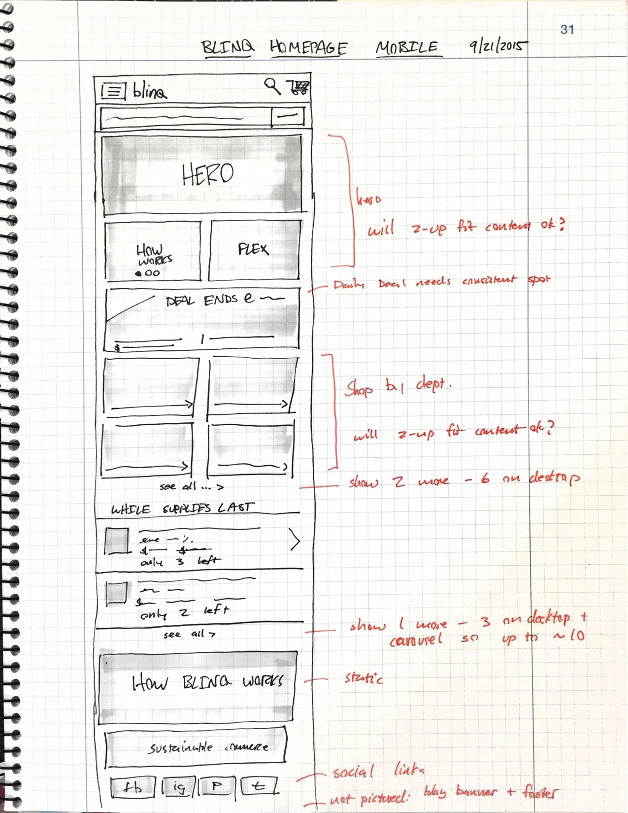
Responsive Homepage
I designed the BLINQ homepage mobile-first to ensure that the ~45% of mobile visitors had a first-class experience.
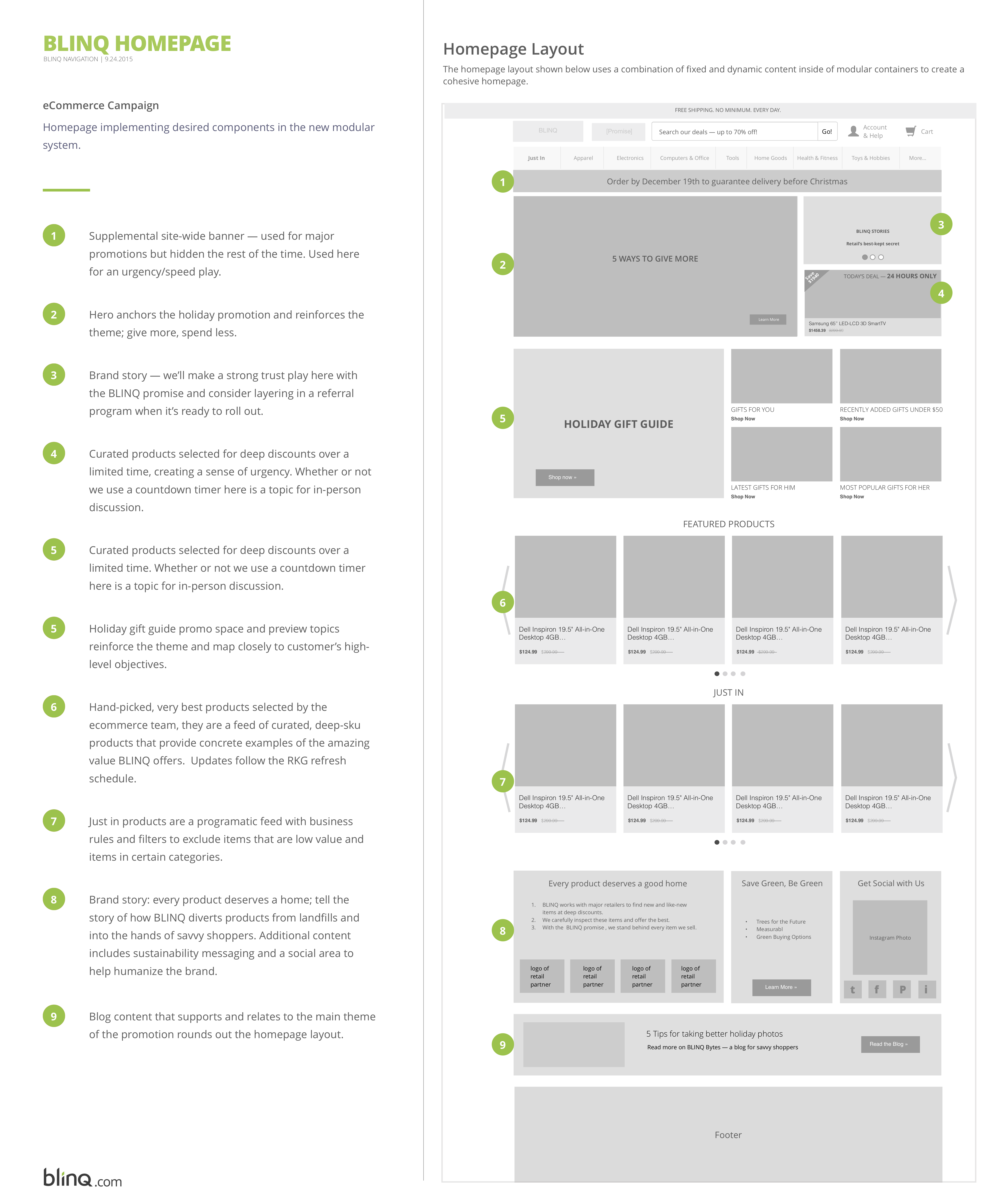
Homepage Features
This wireframe shows how proposed homepage elements meet customer and business needs.
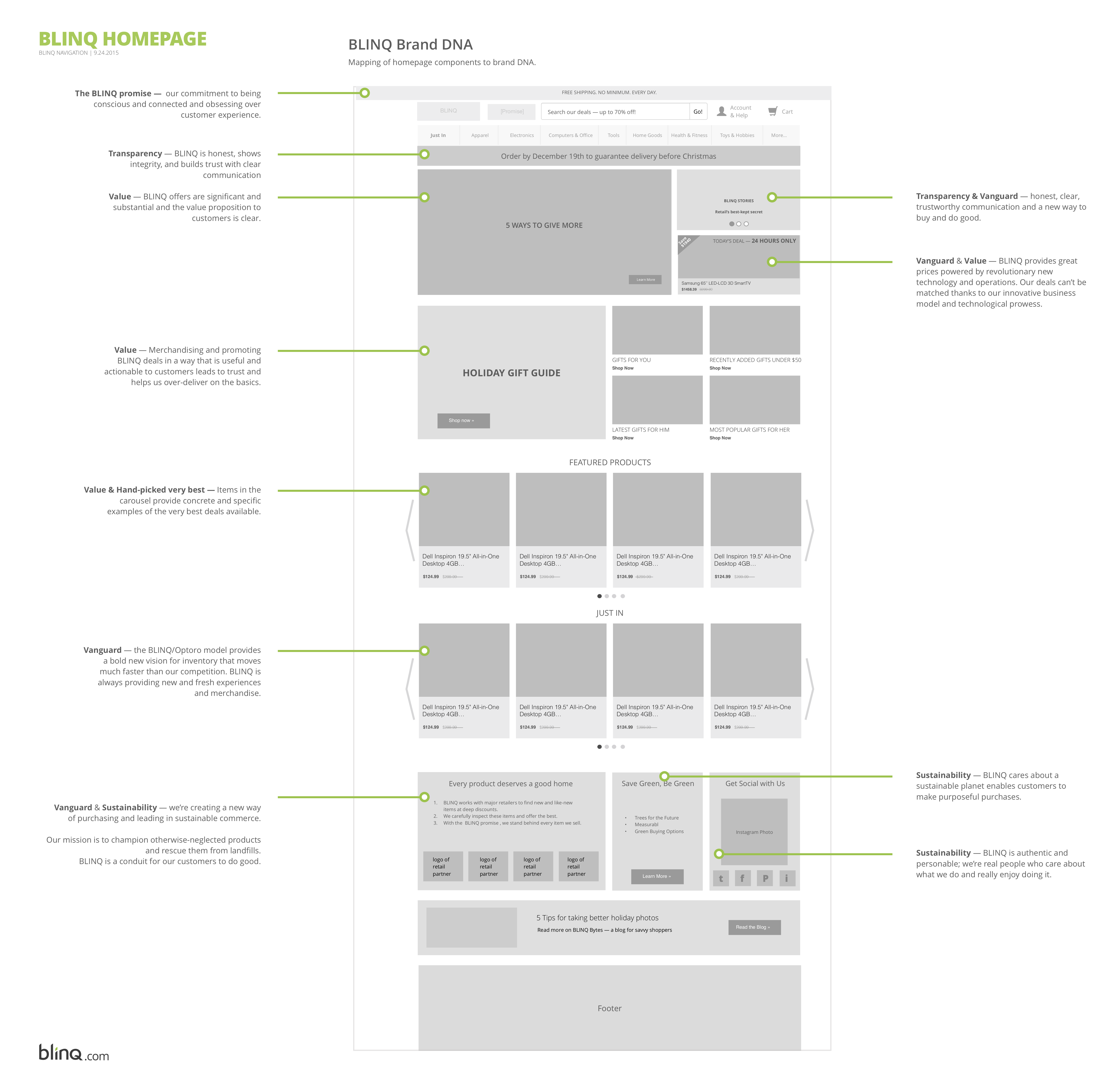
Brand DNA
This wireframe shows how proposed homepage elements follow through on BLINQ's brand strategy.
Results
- The revised homepage layout was completed and deployed as part of a larger rebrand and redesign project lead by an external brand agency.
- Qualitatively, the site performed well in both focus groups and think-aloud usability tests; the new layout performed especially well at (1) helping users understand why BLINQ was so inexpensive and (2) helping users find curated inventory, e.g.: white elephant gifts for an office holiday party.
- The new homepage performed well, with a higher rate of return visits and a higher revenue-per-visit value. It's difficult to de-couple the changes made to the content and layout from other changes made elsewhere on the site as they were released all together to 100% of site visitors.
- In order to more precisely evaluate the quantitative impact of particular changes to the site, new features could be A/B or multivariate tested with increasingly large portions of overall site traffic.
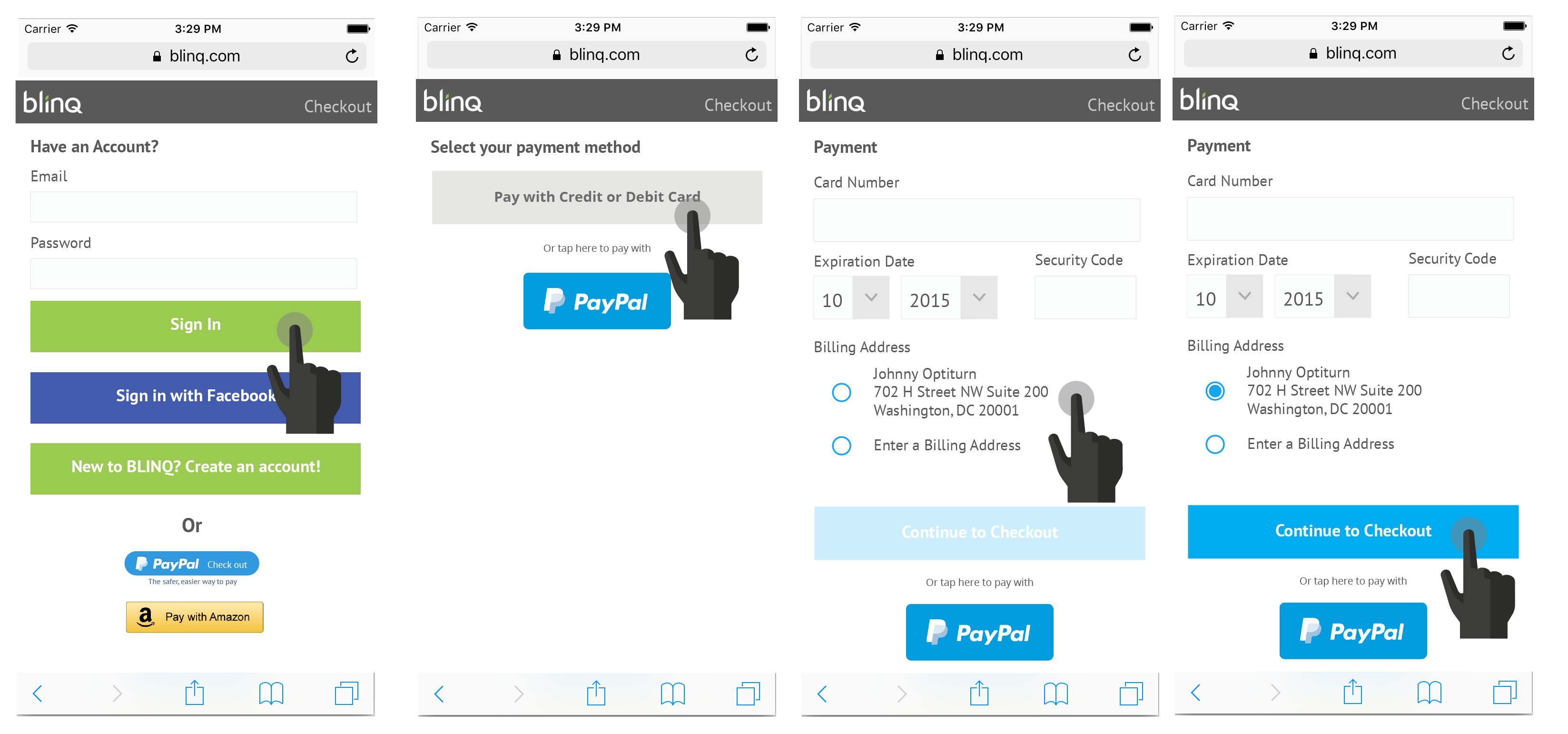
Checkout for Mobile
Problems to solve
- At the time of this work, blinq.com had some pages with a responsive layout and some that did not. The homepage and checkout pages were not responsive. Because most site traffic was referred through google product listings, the impact of a non-responsive homepage was low. All customers making a purchase on a mobile device had to suffer through a non-responsive checkout flow.
- The biggest concern to address was the usability testing feedback that described the jarring shift from responsive product pages to a non-responsive checkout flow as "being taken to another website to ask for my money".
- We expected that moving checkout to a responsive layout would decrease cart abandonment during the checkout flow.
I worked with a product manager and the blinq front-end development team to perform competitive analysis, sketches, wireframing, and prototyping activities. We performed hallway usability tests to collect feeback on the prototypes.
Although many teams approach checkout redesign projects conservatively, we took a more aggressive approach with this layout for two main reasons. First, the current conversion for mobile users was so poor that the risk of decreasing it further was acceptable to the team and product owner. Second, we had a short window of time before the holiday busy season where traffic and business would ramp up significantly. The potential lost revenue of a holiday season with a poor checkout experience for mobile users was not too big a risk.
Primary Navigation Improvements
Goals
- Update BLINQ.com's primary navigation to show categories relevant to users. BLINQ has a category taxonomy with thousands of nodes, so choosing the right ones for the main menu is non-trivial.
- Reconsider the layout of blinq's category menu to allow for more dynamic content; promotions, seasonal offerings, featured products, and other content could help customers find items they care about faster and with less effort.
Working with a product manager, a developer, and a third-party provider (our navigation was powered by a third-party) we performed a rigorous data analysis, conducted card sorting activities with customers, and wireframed a number of possible navigation enhancements.
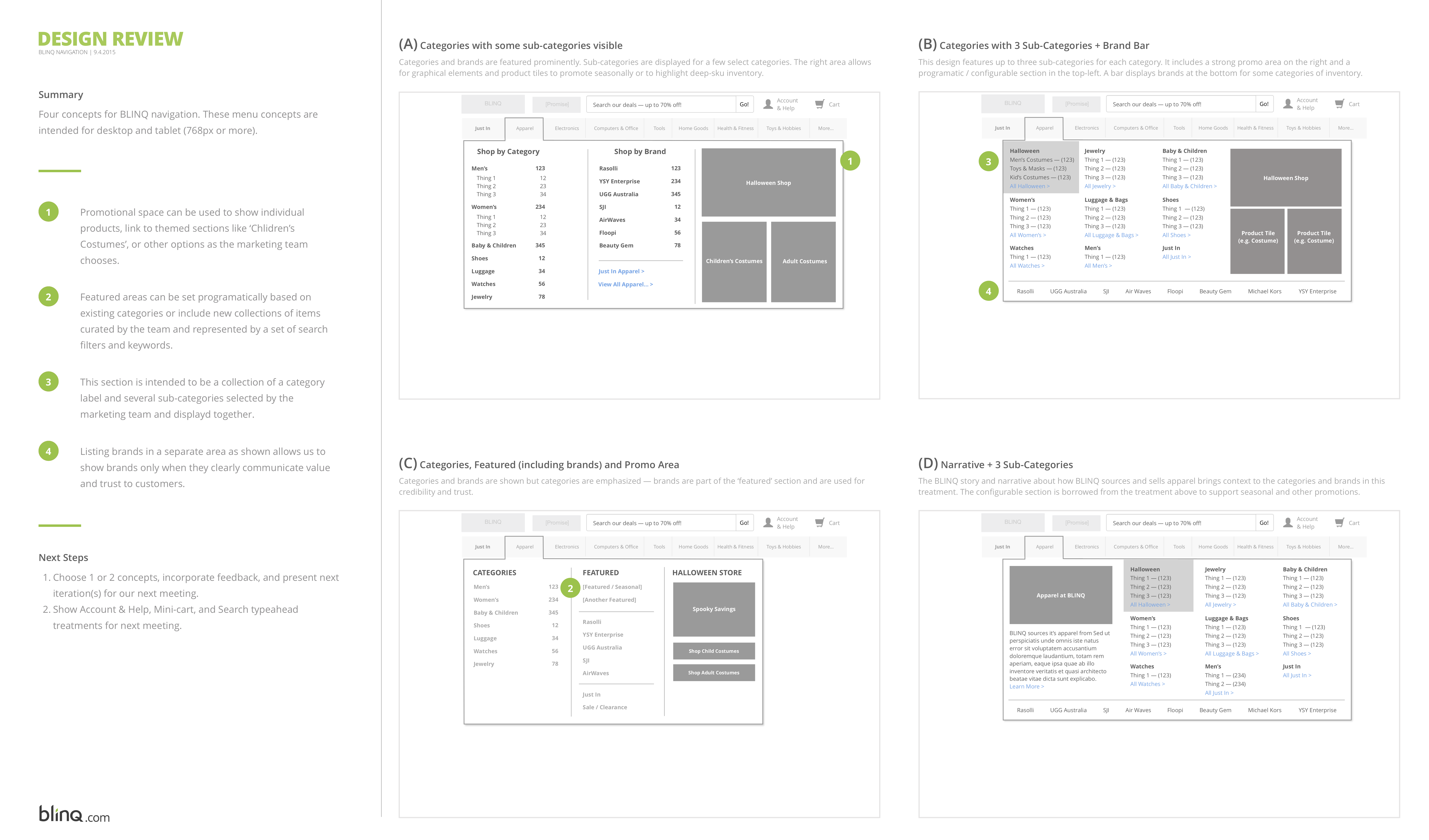
Results
Our enhanced navigation improved click-through rates on the new set of categories shown in the menu while also creating room for promotional space to list featured products.